DESIGN
As part of the Arlingtonian editorial board, we have a graphic arts editor and layout editor. Staff writers are responsible for requesting their own graphics and photos from our team, however the original design of their layout comes from themselves. After observing inconsistencies in layout quality and visual organization in previous years, I introduced one-on-one design meetings this year. Each layout is now reviewed in a meeting with the layout editor, the writer, and myself, where we evaluate the layout and discuss revisions that could strengthen the story’s visual presentation.This includes going over many elements of design like balance, dominance and contrast.
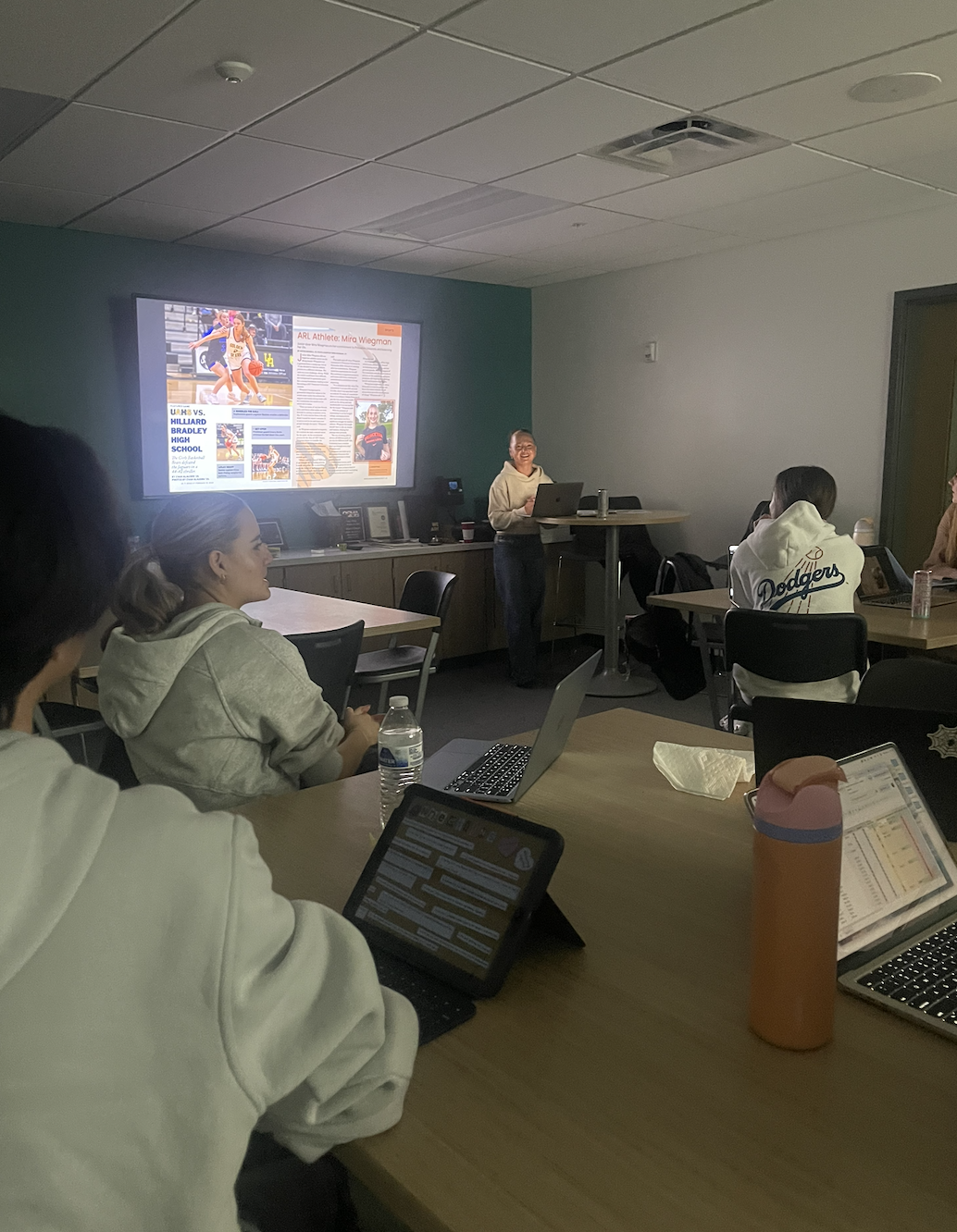
This year, I created more time for layout workshopping prior to printing. By establishing a print calendar at the beginning of the year, I was able to include a week of extra time for design editing purposes for each issue. This adjustment allowed our layout editor and myself to collaborate with the staff to review layouts all together. We typically screen mirror our draft of the issue, arranging stories side by side to evaluate spacing and overall cohesiveness. The extra workshopping time allowed for refinement of design elements and created in much stronger cohesion across spreads.
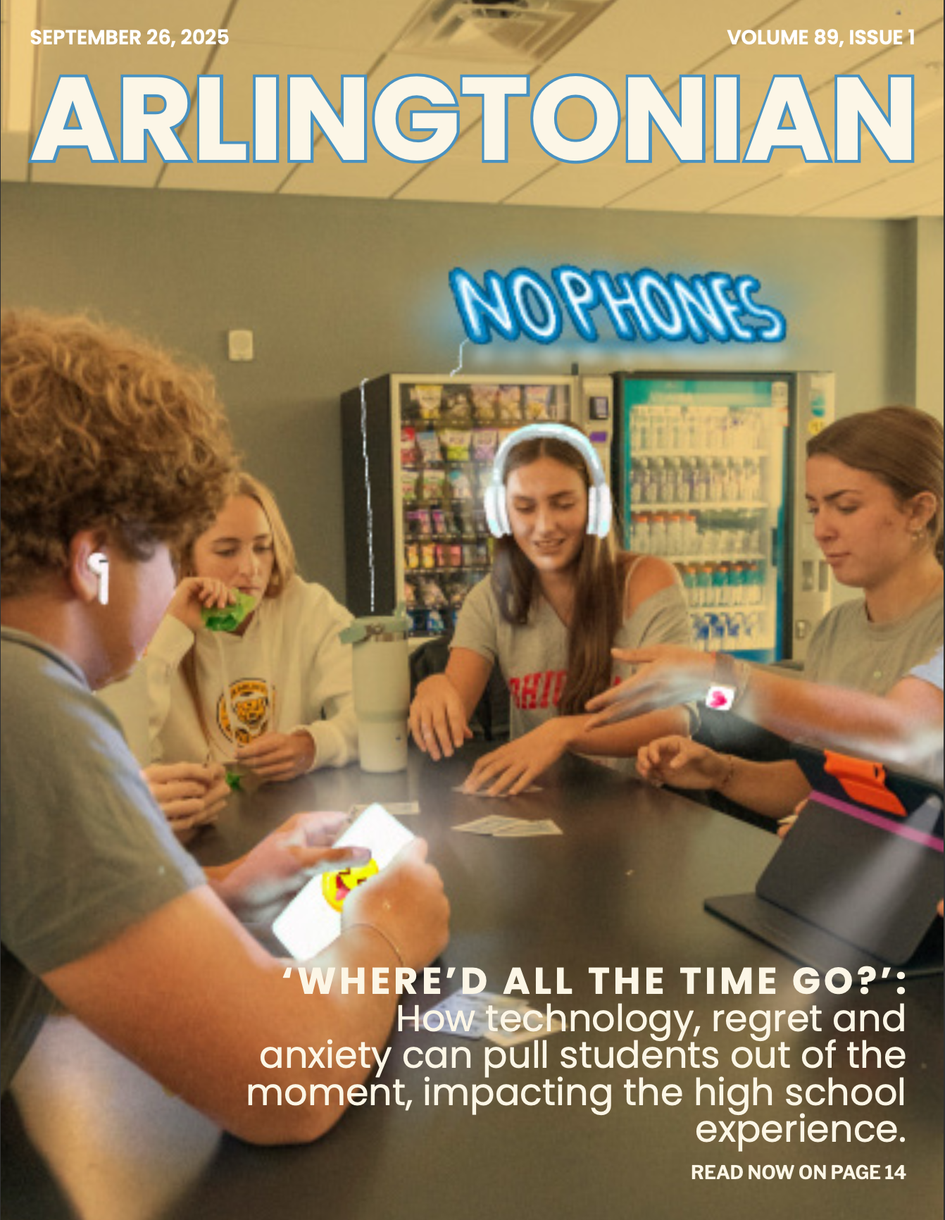
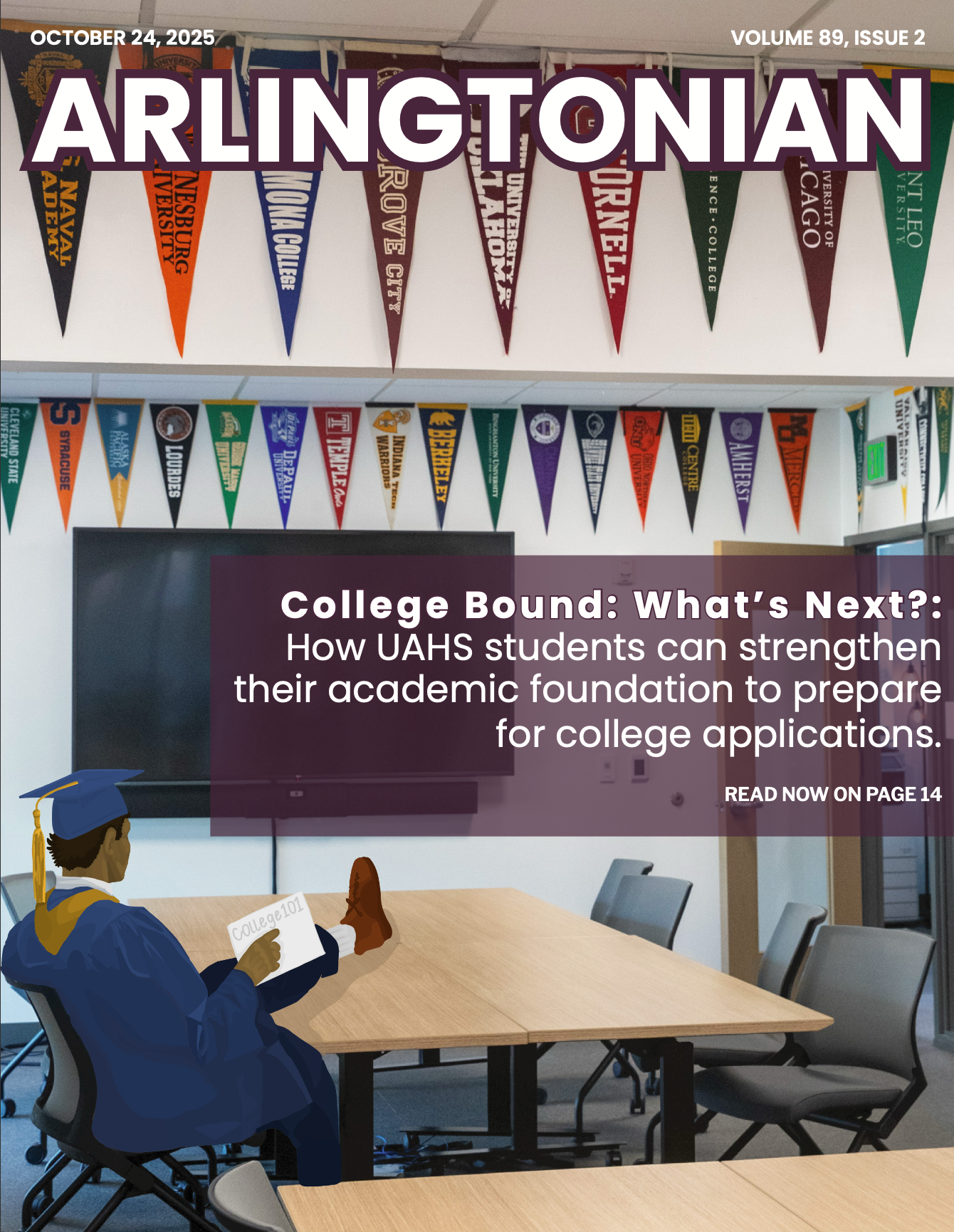
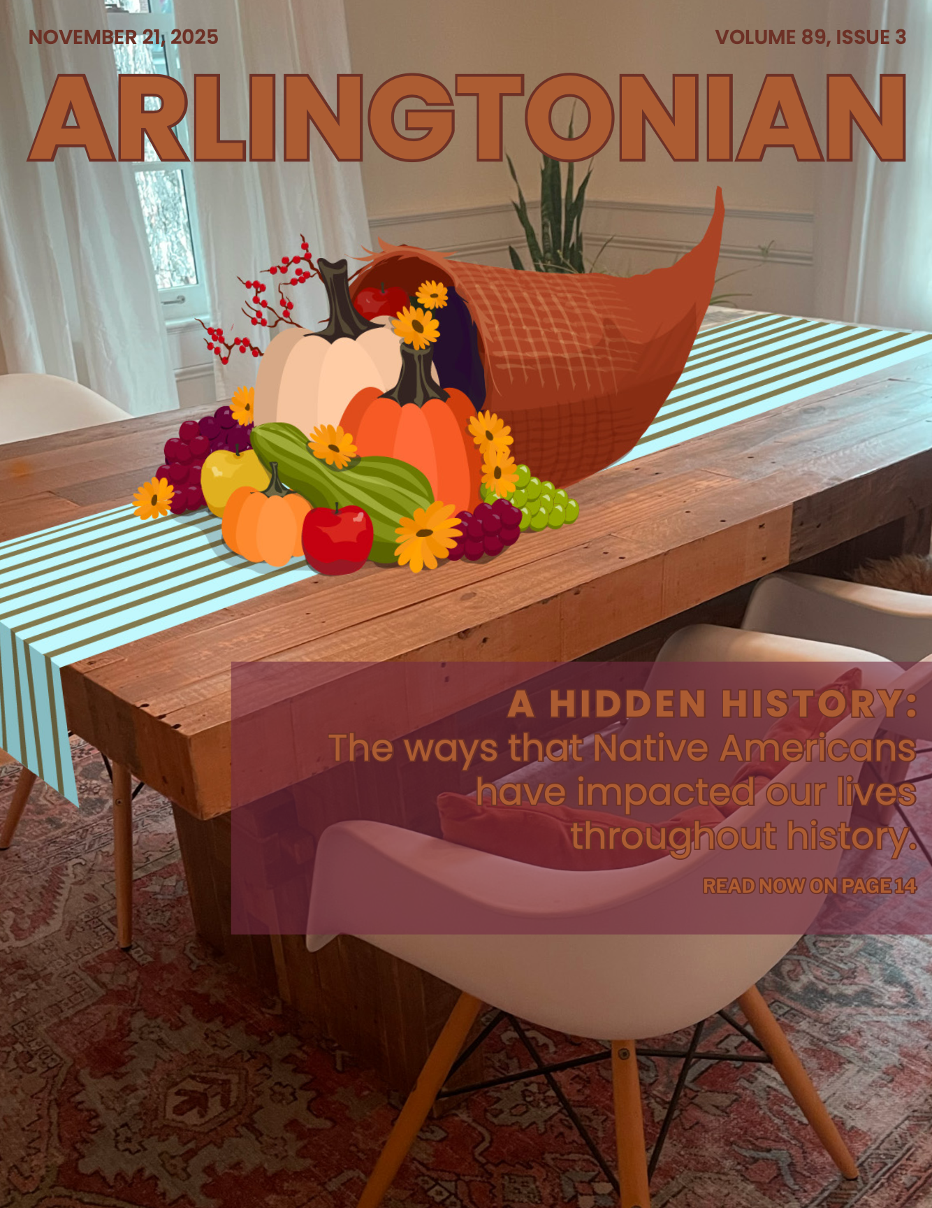
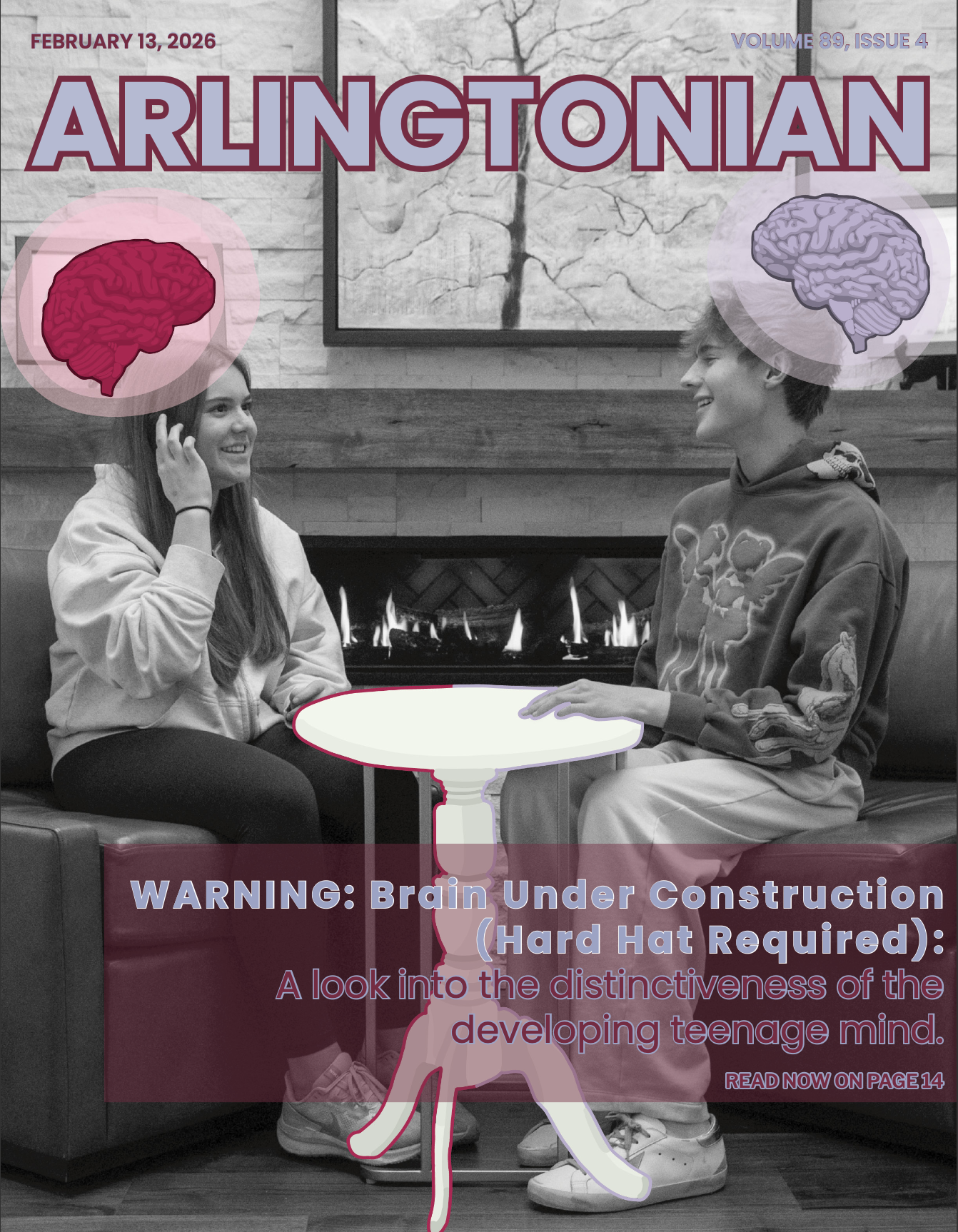
Covers of issues 1, 2, 3 and 4 with the new design of having a photo background and graphics on top.
After receiving feedback from administrators and teachers over the summer, I thought of a new visual idea for Arlingtonian’s cover designs. In previous years, covers relied primarily on graphics instead of photos. The feedback was to incorporate photography to have a more authentic representation of student life at UAHS. In response, I worked with our arts editor to integrate dominant photographic imagery layered with graphic elements, creating covers that conveyed visual meaning.
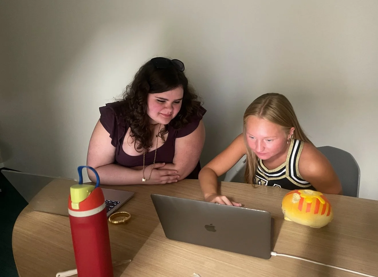
Each cover intentionally has the image of a table, a consistent visual element across all issues. The table carries symbolic meaning within our publication; the idea that everyone has a seat at the table. This visual device allowed the covers to function as both a cohesive design feature and our publication’s identity.
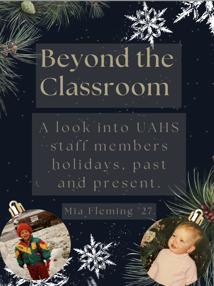
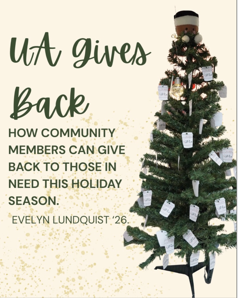
Our design strategies also exist through Instagram story teasers that are used to promote upcoming stories. These posts are developed using Canva, with the same design strategies that are applied to print layouts. Social media requires immediacy within a limited viewing time, so our story teasers prioritized focal points and high-contrast compositions to capture attention quickly.
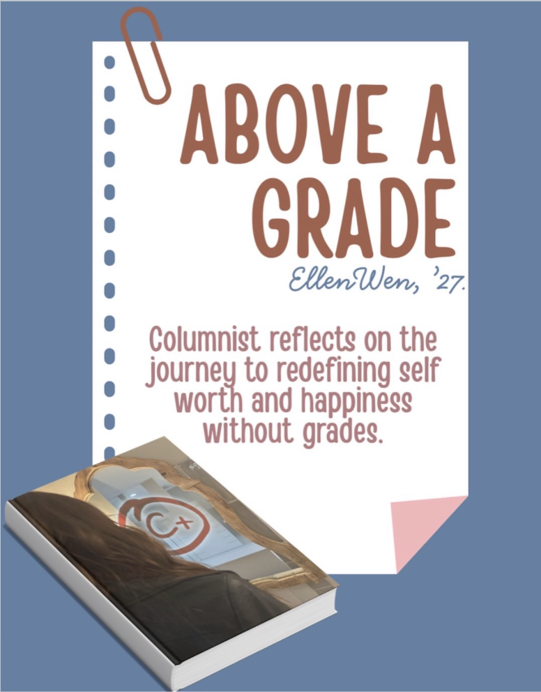
Examples of Instagram teasers that were made using Canva to promote upcoming stories.